Categories
Consulting & Freelance Portfolio

Small Ecommerce Website

Ask

McStuffies, PhD is a crafter who sells their handmade items at craft fairs and online. Their main offerings are crochet stuffed animals and dolls, but more recently they’ve branched out into buttons, stickers, and other custom designed items.

The client had been using Square for both payments and an online storefront, but was dissatisfied with aspects of the inventory management and tagging offered by that platform. They purchased a domain and hosting for a WordPress/WooCommerce site and hired me to help them migrate to the new site.

There was no budget for themes, and while I’d worked with WordPress before, this was my first experience with WooCommerce.

Before: Screenshot of mcstuffies-phd.square.site Shop page

Process

There were several tasks to complete itself:

  1. Import data from Square and troubleshoot ongoing sync issues. This was the client’s responsibility, but I offered support as needed.
  2. Adjust category/tag taxonomy to better suit client’s needs and make the site more navigable. Because the client maintains these, I did not make significant changes to the labels themselves, but created a hierarchy and made suggestions. Some categories became obsolete thanks to WooCommerce’s default features, including “Sale.”
  3. Identify and test suitable WooCommerce themes and layouts. Options were limited, but we landed on Boutique, a child theme of Storefront, due to overall layout preferences and customization options.
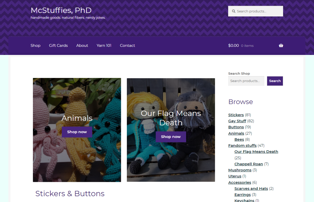
  4. Create custom color scheme, CSS, and assets as needed. Client had an existing logo that I was able to incorporate into a default placeholder product image and site favicon. The logo also served as the basis for the overall color scheme, its dark teal and coral red finding balance with a deep purple, earthy yellow, and pale mint.
  5. Build a new homepage to feature categories and products according to the client’s needs. For the sake of simplicity, we launched with top categories featured, but as they grow into the site, they might take advantage of functionalities like “featured products.”
  6. Migrate static informational pages and develop new features, including a basic contact form to replace a simple email link and a new events schedule. I created a simple blog post template for the client to enter craft show information and added a plugin to make copying posts easier. The calendar was embedded into the new homepage using a plugin.
  7. Take feedback from the client and testers to make adjustments to the layout, especially on mobile.
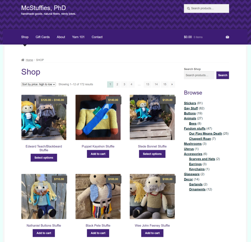
After: Screenshot of mcstuffiesphd.com Shop page built with WooCommerce

Result

I wanted to leave the client with a website they felt confident with, and in that, we succeeded. The new McStuffiesPhD.com offers a cleaner layout with a pleasing color scheme that’s easy to browse on any device and easier to maintain for the client. It’s designed with a certain amount of whimsy, as appropriate for the nature of the products available, without being content-heavy, slow, or overwhelming.

The homepage includes two important features to drive sales and engagement: a display of “latest” products in popular low-price categories (stickers and buttons) and a list of upcoming craft fairs and events where visitors will find McStuffies, PhD in person. The calendar in particular gives the client and customers alike a central place to locate this information (which might otherwise be found in scattered social media posts) and promotes events within their regional community.

Having never previously set up an ecommerce site, the whole project was a great learning experience, especially in terms of problem-solving when it came to technical and display issues. We weren’t building something from scratch or reinventing the wheel, just trying to make the client’s life easier and better present their work within constraints. It’s also given me a few things to better incorporate in future projects at an earlier stage, such as improving content for accessibility and a stronger focus on the mobile experience.

Categories
Job Search

1: Visibility of System Status

“The design should always keep users informed about what is going on, through appropriate feedback within a reasonable amount of time.”

Nielsen’s 10 Usability Heuristics for User Interface Design

Applying for a job opening via nearly any type of online portal is an exercise in flinging your resume into a black box.

Some sites offer the appearance of visibility—an “application status” view—but I’ve never found this to be meaningful. The only way you know if your application goes anywhere is (a) if the recruiter/hiring manager reaches out to schedule a chat or (b) you receive a “we know it takes guts to put yourself out there, but it’s a nah from us” (typically automated; not uncommonly including some frankly unnecessarily condescending language I’m sure is meant to be a nod to respecting applicants’ time and effort). 

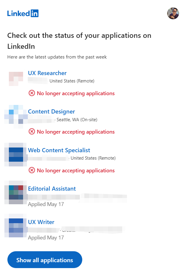
linkedin email screenshot
Screenshot of an email from LinkedIn with the subject line, “Emily N. , you have new application updates this week.” Body reads: “Check out the status of your applications on LinkedIn,” then includes three roles that are listed as no longer accepting applications and a two that simply include the date of application. Company names, logos, and in some cases location have been blurred for privacy.

It’s not that I’d ever expect a true, realistic tracking of every application once it reaches its destination, but as part of this evaluation, it’s worth noting this as a pain point for job seekers. For example, in my own application tracking, I code “rejection” and “assumed rejection” separately. At the end of each month, I move every unanswered application over two months old from “awaiting response” to “assumed rejection.” To date, I have about 50% more assumed rejections than explicit ones.

Beyond the black box of job applications, there’s the overall system visibility—the context of companies doing the hiring and the industry as a whole—to consider. Candidates have a few tools at their disposal to research: online commentary and company information, review sites like Glassdoor, or good old-fashioned human connection and word of mouth. (I guess some people call this “networking,” but I’d rather eat glass.) Each of these helps paint a picture of what’s going on, but must be taken with a grain of salt.

Prospective candidates are unlikely to have any awareness of things like internal upheaval resulting in job openings being canceled or the effect of downsizing on recruiters’ workloads. Nor can we always suss out when hiring has been delegated to a third-party recruiter, further diluting the context of the role and system it falls into.

It isn’t typically feasible to inform candidates about these constraints, but ensuring that even automated rejection messages are sent to all applicants would be an improvement on the status quo. As for visibility of the system status of companies and industries themselves, well, that’s undoubtedly a far broader issue.

Categories
Highlights

Tumblr in Web Search Experiment

Explored ways to feature relevant, engaging Tumblr content in Yahoo web search results.

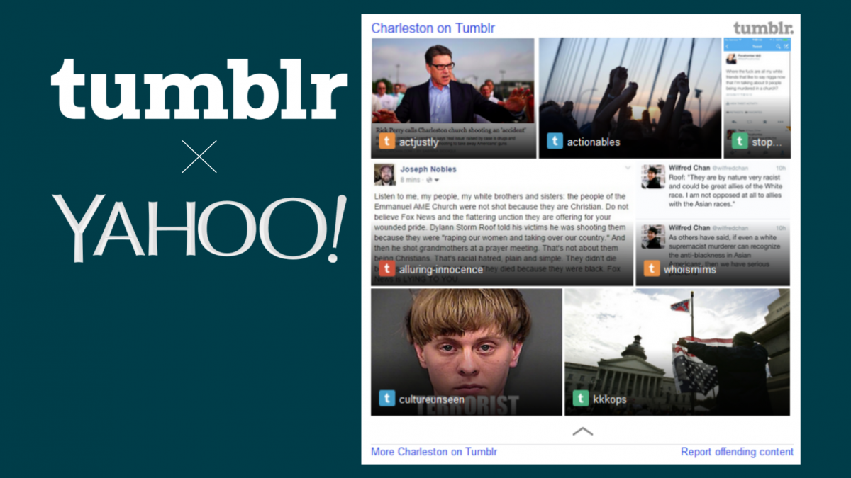
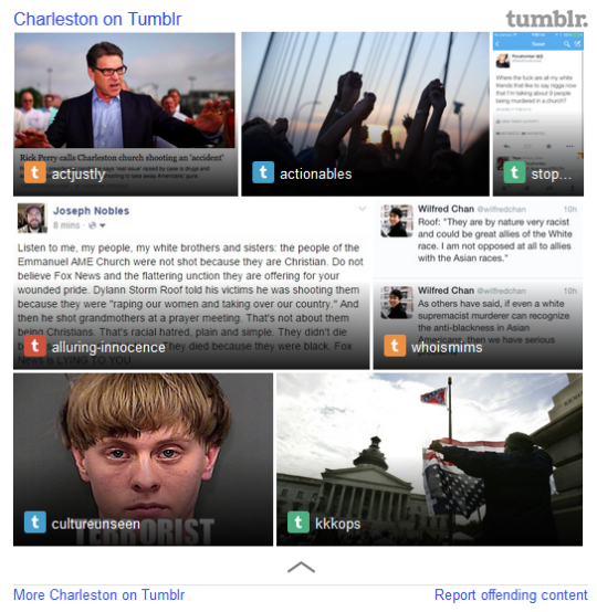
Screenshot of Tumblr search results experience for query "Charleston" sometime after the horrific church shooting
Tumblr in Yahoo Search results (no longer live)

Ask
After Yahoo acquired Tumblr, Search leadership asked me to find a way to feature Tumblr content in web search results.

Process
I started out with several things to consider:

  • Understanding the type of content on Tumblr
  • Determining what content, if any, could map to real web search user needs
  • Figuring out what metadata we could extract from Tumblr posts and whether it was enough to work well in our content management platform
  • Learning as much as we could from what little data the Tumblr team could share with us

Because I was unable to discover much evidence of existing Yahoo search-to-Tumblr content behavior in our logs, and the nature of Tumblr’s content is freewheeling and relatively unstructured, we had to experiment.

The first test featured content from specific Tumblr users (celebrities, online personalities, organizations–entities with discrete matching queries) in a simple image carousel. Limitations of this approach: only image-type posts could be displayed, so blogs with text posts, links, etc. would appear with limited results or none at all, despite frequent updating; we could only trigger on keywords that had a clear match to a single blog (e.g., Beyonce, ZooBorns). As a result, coverage was low, and leadership tasked us with significantly expanding the experience.

“[Emily] took on a very demanding team that wanted to create a new experience for users with Tumblr content. She patiently worked with the team and in many instances stepped in to help move the project forward. Without her it would have taken much longer to launch the experience on Search.”

Product Manager, Search

To accomplish this, I needed to rely on automatic triggering methods that offered far less control over what content appeared in search results. Despite concerns about relevance and quality, we launched a test for a small percentage of search traffic. The initial test had to be taken offline within days because, although the backend team took steps to remove content flagged as “adult,” pornographic results (and worse) slipped through.

Search leadership was determined, however, and resources were provided to dramatically improve the indexing for quality and cleanliness. The backend team also added logic for when to return content at all, based on timeliness and other factors. A visual designer was brought in to collaborate a unique template for Tumblr that accounted for the variable types of content and included more Tumblr branding (color, logos). The UX and content improvements launched as a test for a small percentage of search traffic, and although metrics weren’t impressive, it didn’t cause major problems, and the feature launched for all desktop web traffic.

“Emily did an outstanding job on the Tumblr [search experience] presentation for the Tumblr team. She has built a [search experience] that puts a stake in the ground until Science can develop more precise triggering.”

Product Marketing Manager, Search

Seeking to experiment further in hopes of improving and better understanding its performance, I took the initiative to categorize queries that triggered the Tumblr module and identify categories that might be well-served with Tumblr content. I used existing keyword lists roughly mapping to a dozen or so categories and set up a test bucket version of the module with only these categories with logging for each. I also wanted to see if other factors affected performance, including where the module appeared on the page (“slotting”) and how consistently it appeared (whether to ignore backend display logic). I tracked and compared my experiment’s performance to the primary module’s on a weekly basis, using that data to make small tweaks to each category along the way.

Result
The great Tumblr in search experiment ended after about a year and a half, when leadership decided the investment was no longer justifiable. Despite the effort’s ultimate failure, I was recognized for my contribution and creativity.

Key categories in my final experiment did show some lift in performance: food, books, holidays, fictional characters, TV series, and movie series.

Categories
Highlights

Social Media Survey Research Plan

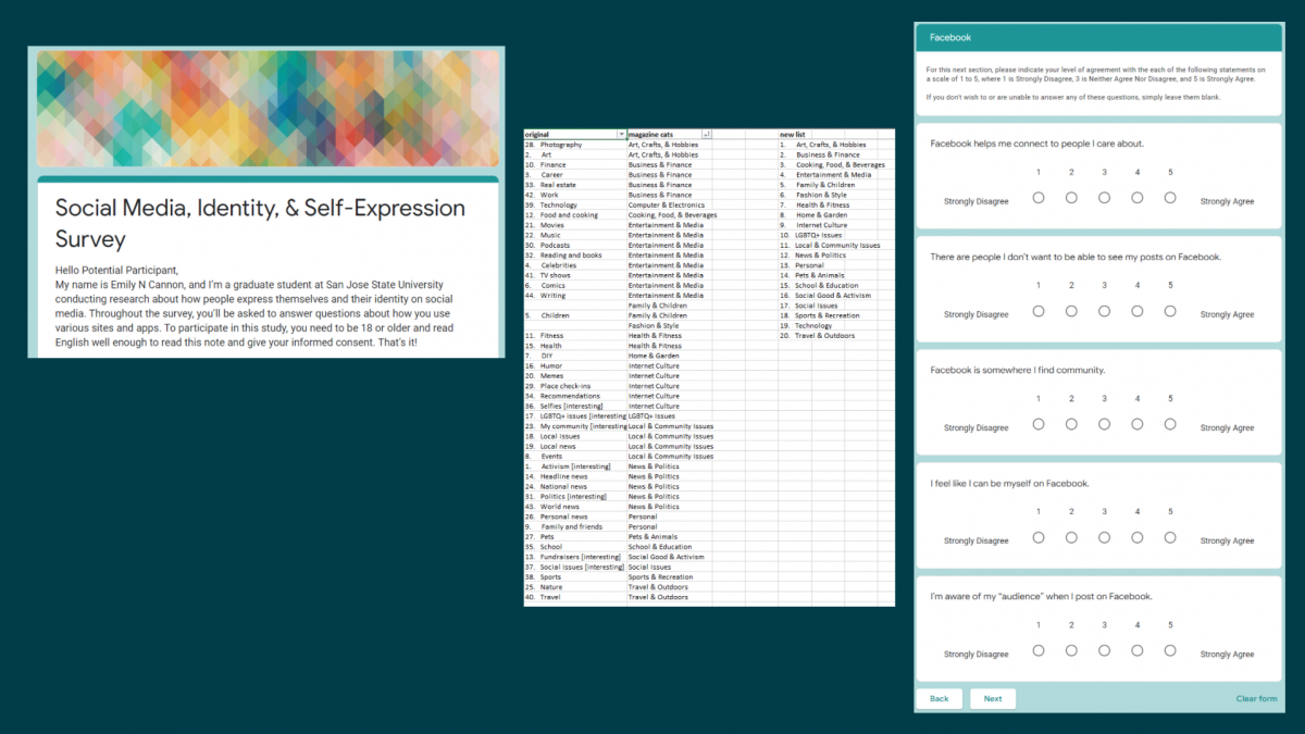
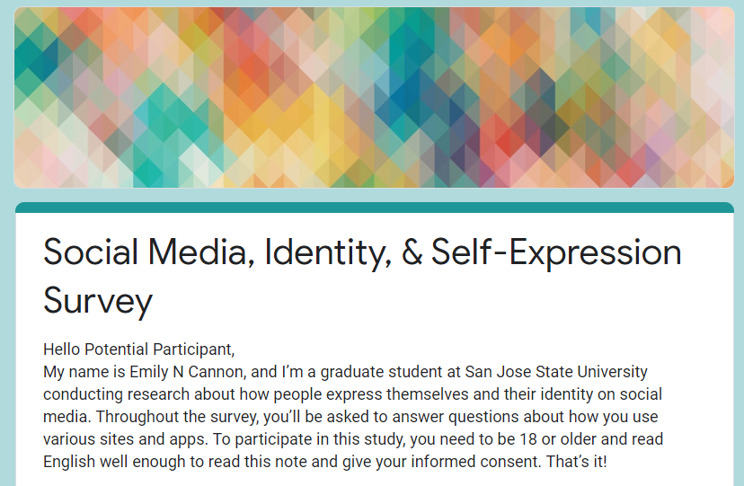
For my graduate-level survey research methods course, I devised a questionnaire and research proposal to investigate attitudes about personal disclosure and privacy on different social media platforms, especially among gender diverse people. I hypothesized that individuals with marginalized identities, including transgender people, would be more likely to either disguise or hide aspects of their identity or share less personal information on social media sites where those identities and/or perspectives put them at greater risk for harm, such as abuse, threats, or career problems.

As a solo project, I was responsible for developing the questionnaire, performing background research, and writing the proposal. Throughout the project, I consulted with my classmates, instructor, and external contacts to test and improve the survey instrument and overall research direction. To explore my research question, I knew I needed to collect survey data on two key areas: social media use and demographics. The specific question and answer sets for each were informed by background research, in particular several previous scholarly studies of social media and identity, as well as general knowledge of survey design best practices. 

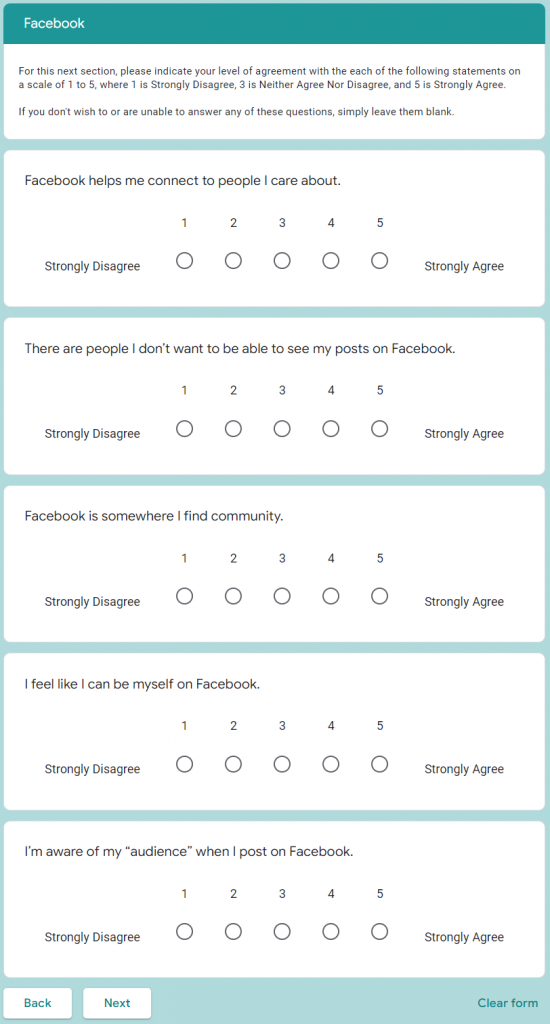
There were three sections of social media questions, one each for Twitter, Instagram, and Facebook, each with nearly identical question and answer sets (UI copy and functionality differences between the sites reflected) so they could be directly compared. Each section began by asking respondents how often they used a given social media platform and only those who selected “I use it once a week or more often” were shown the following question set. The questions for each platform were divided into two pages to reduce participant fatigue. The first page asked participants about the type of information they share about themselves and their interests and what kind of privacy settings they use. The second, shorter page asked users to rate their agreement with five statements on a 5-point agreement scale. These statements were particularly influenced by previous research about online privacy concerns and community.

Screenshot of agreement questions from Facebook section of survey

For demographics, I wanted to include more aspects of identity than just my area of focus (gender) without seeming too invasive, as well as deliberating excluding answers that might identify respondents. Age was asked as a set of ranges; disability status was a simple yes/no; most questions allowed for multiple selections and every item could be skipped or marked “Prefer not to answer.” “Other” with a text field was an option for many questions, but I aimed to design the questionnaire so most respondents could easily answer without writing anything.

According to feedback from peers and survey testers, I mostly succeeded in my goal to write an easy-to-answer questionnaire that gave respondents options they felt described themselves and their point of view. Data collected with this instrument would have been readily analyzed and compared with (hopefully) minimal manual coding.

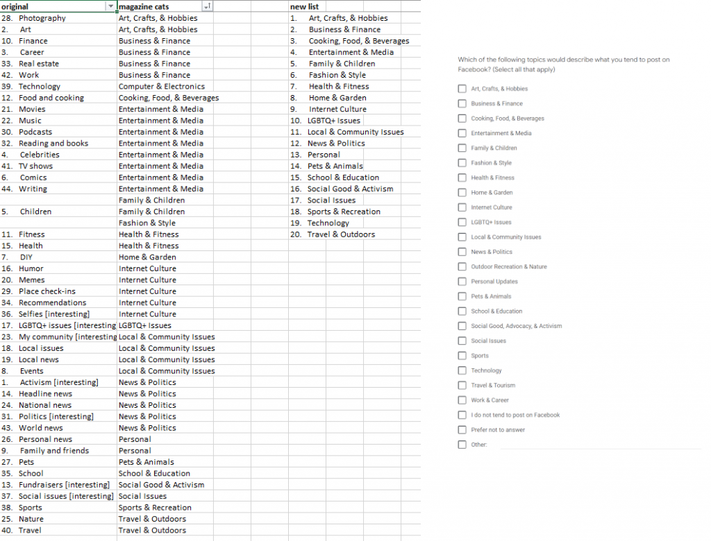
An important challenge I faced when designing this questionnaire involved writing questions and answers that were complete, accurate, AND readily answered without being time-consuming. Some of my questions asked users to recall information they might not have in mind, such as profile fields they completed. In an effort to eliminate open-ended questions entirely, I made a list of topics that people might post about, which started out very long (40 or so items) and ended up with 22 named topics, 14 of which combined two or more related topics. These labels might not have been a great fit for many respondents’ mental model of their interests, and I heard feedback from survey testers that they were confused about which boxes to check for more specific interests they had in mind. Additional user testing prior to launching the study would be ideal. Additionally, had I moved forward with this proposal, a key concern would be sampling–gender identity is not a screening question, nor can a gender diverse population be effectively quantified for the sake of random sampling techniques, so careful, targeted recruitment would be necessary to attract respondents with marginalized identities.

Screenshot of a spreadsheet with work-in-progress topic labels next to screenshot of question as it appeared in the survey

Research proposal and questionnaire (PDF) on Google Drive

Throughout this process, it was a pleasure to reconnect with survey research and quantitative analysis skills I first honed working in market research once upon a time. I learned quite a bit about the existing body of research about user behaviors and attitudes toward social media. We sometimes think of this as an emerging field, but relevant studies go back at least 20 years to online forums, newsgroups, and early social media like Friendster. It reinforced my desire to incorporate intersectionality and inclusion principles in my work as much as possible, which is why I did not opt to limit the study to participants of a particular gender identity and instead collect demographics that may reflect multiple oppressions to better contextualize my (proposed) findings.

/ iSchool, Portfolio, research, writing

Categories
Highlights

UX Evaluation & Prototyping: Recipe Search

For my graduate-level web usability course, I completed a solo project that explored a design problem and its possible solutions. I hypothesized that a key problem with recipe search experiences is the discoverability and ease of using filters so users could easily sift through recipes irrelevant to them based on ingredients, diet, style, or other factors. I focused on Yummly.com, a recipe search tool that already offers many of these filters, but could use improvements in some aspects of the user experience.

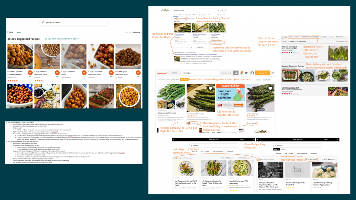
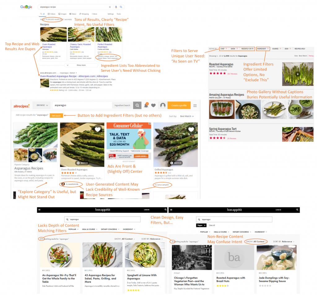
Compilation of annotated screenshots highlighting possible UX issues with top recipe search experiences
Screenshot of notes from informal user interviews collected via Instagram direct messages

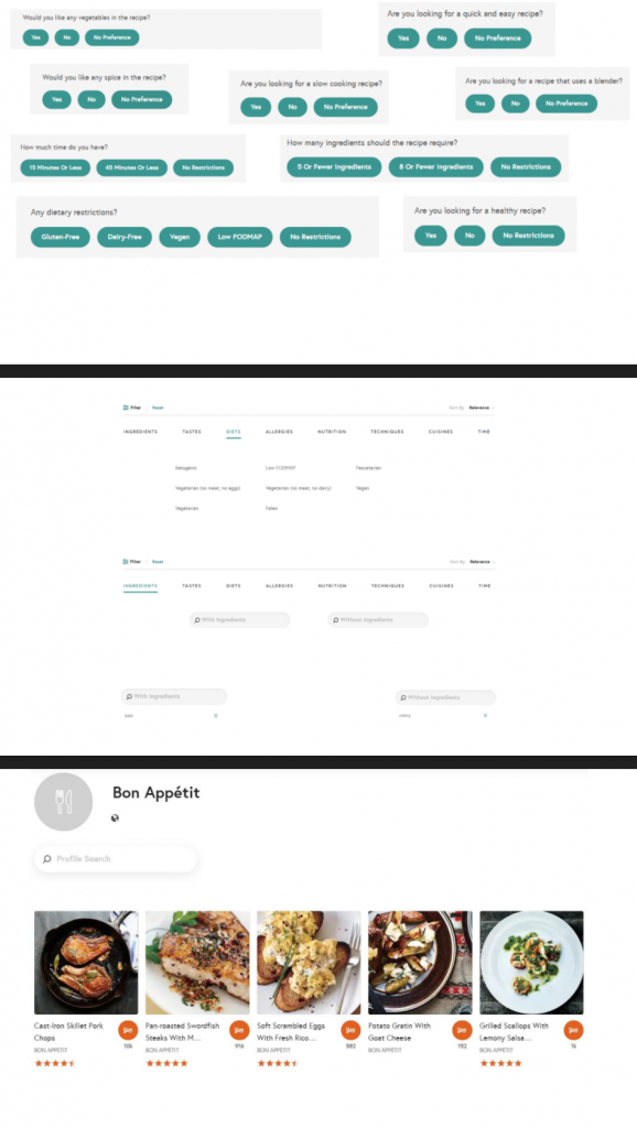
Without a budget or resources for in-depth user research, I reached out to my personal network via Instagram to solicit feedback on recipe search experiences, including what they use to find recipes and their frustrations with recipe search. After identifying key user concerns, I performed competitive analysis of top recipe sites and identified their strengths and weaknesses. Based on this background research, I devised a list of potential user interface changes, taking heavy inspiration from Jenifer Tidwell’s Designing Interfaces patterns. These included a clear entry point the filter wizard to make this feature more prominent; adding modules for features results and suggested filters within the search results to enhance discovery and help users struggling with too many results; and using modal panels (popover windows) for filters, results, and source pages to address the problem with jumping users out of the search results without any way back. I also designed a “favorite site” feature that, in conjunction with an existing “saved recipes” function, could help personalize results for logged-in users.

Screenshot featuring multiple slides with prototype components

I faced significant challenges while working on this project, not least because it happened during Spring 2020 and COVID-19 restrictions severely limited my ability to perform prototype testing. Although the assignment only called for paper prototypes, at the time, I found it easier to use PowerPoint to develop a high-fidelity clickable prototype using screenshots, shapes/text, and embedded links to other slides to simulate clicking and scrolling. I had not yet become acquainted with professional wireframing tools and my instructor did not encourage remote user testing, so I could only test the experience with my partner.

Even this limited testing suggested a number of changes for a second iteration of the prototype and was an informative experience. Overall, as a first attempt at a solo user research and testing initiative, I learned quite a bit about how much I have to learn from other people–even people who are relatively “similar” to me–and that even relatively small-looking design iterations require thorough consideration. I also really enjoyed the process. Details of my process, findings, testing, and learning reflection can all be found in the linked report.

Categories
Highlights

Redesign Proposal: Gardening Information & eCommerce Website

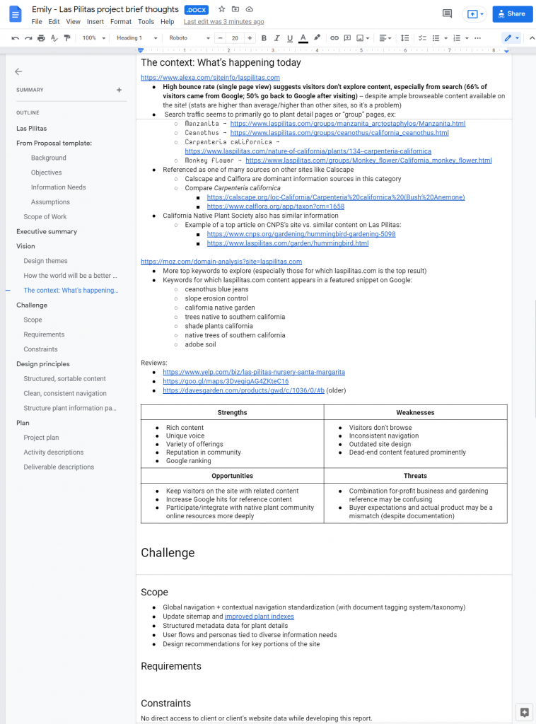
For my graduate-level information architecture course, I teamed up remotely with two classmates to complete a semester-long design proposal with several distinct components and deliverables, including content and business strategy, content inventory, user research plan and initial card sort task results, personas, and mock-ups or wireframes. We chose to focus on the website of the family-run California native plant nursery Las Pilitas, a treasure trove of information about gardening and nature that appears among the top Google search results for queries relevant to its somewhat niche interests, but suffers from navigation and wayfinding issues. Based on the publicly available SEO data we could find, we posited that a relatively high bounce rate reflected this poor navigation, meaning users landed on a particular page, such as a page about a popular plant family, but did not explore image galleries, information about specific varieties of the plant, advice about landscaping with these plants, and so on.

Screenshot of my early research notes

As students, my teammates and I balanced responsibilities in order to maximize learning, as the project was an opportunity to practice a variety of skills and gain experience with new tools. I created all the wireframes in Balsamiq; developed our content inventory process in Airtable; designed the report, personas, and and slides; performed competitive and background research; drew the final version of the site map diagram; and did light project management/tracking in a simple spreadsheet.

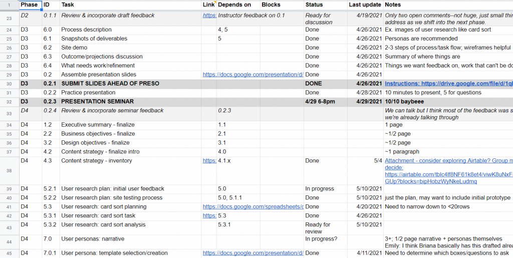
Screenshot of a portion of our project tracking spreadsheet

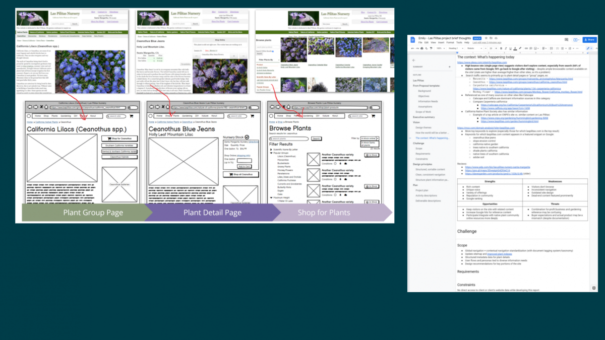
Based on content inventory and competitive research, we knew we needed to improve the site’s overall organization for more meaningful breadcrumbs to give visitors entering via web search a sense of where they’re at and what else they might explore. We expected this would also support effective “related” links on deep nodes like plant detail pages. Additionally, we wanted to explore modernizing the global navigation bar with a fat menu design. We tested a number of possible user flows on the existing site and noted pain points to accomplishing common user goals like making a purchase or finding plant information, which informed several smaller decisions in terms of buttons, tooltips, search interface, and media experience.

Since this was a student project with no client contact or budget for in-depth user research, we were limited in our scope. The wireframes, labels, and personas are all effectively a first iteration and would undoubtedly evolve over the course of doing real client-contracted work. In particular, I’d like to be able to see site analytics and search traffic data to more effectively identify important entry points and stress cases for visitors and customers. Additionally, the content library is enormous, far too many documents to cover for our project, but a thorough accounting of the site’s content and how it’s internally linked would be an important starting point for a site redesign.

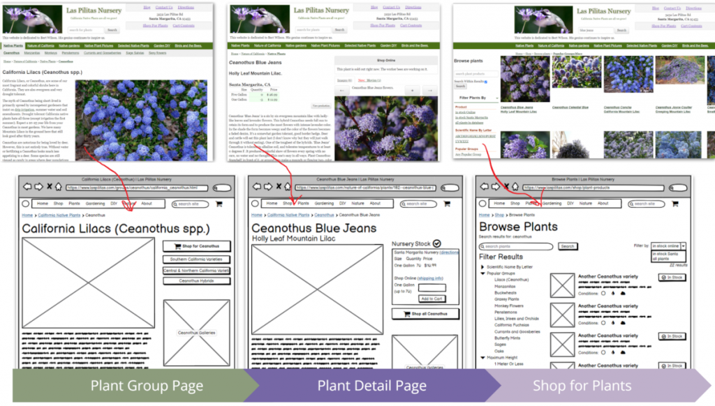
User flow from entry point (plant group page) to a plant detail (product) page to shopping experience comparing existing experience with proposed redesign wireframes

Translating ideas and inspiration to a coherent mock-up requires creativity and a clear sense of your users and the product. We realized that, for as much as we could do on spec, our work would only really be actionable after we could address the limitations. Despite that, the team benefitted from the collaborative design process overall and enjoyed learning new tools, like Balsamiq, Lucidchart, and Airtable, to make design ideas tangible.

Categories
iSchool Portfolio

Social Media Text Analysis: Reddit

Based on a student data project that used Python machine learning libraries to analyze text from the social news and discussion site Reddit, we developed a scholarly research paper to submit to the HICSS 2022 conference. Focused on two popular advice subreddits, we created manual coding data to identify user demographics disclosures, described whether any patterns could be observed when comparing user metrics and algorithmic scores, and speculated on the role community moderation played in interpreting study data. I was first author on the published paper, co-author of the original student project, performed much of the data labeling and quantitative analysis, and presented our findings at the virtual conference. I offered guidance and feedback for other authors.

Because basic statistical analysis failed to suggest any interesting patterns with metrics or text analysis algorithms, we chose to frame the study as an exploration of behavior and identity disclosure in semi-anonymous environments. To that end, we needed to expand our original attempt to automatically extract demographics based on text pattern matching logic and instead manually reviewed each post to identify age and gender, if explicitly included. This allowed us to draw inferences between our forums of interest in terms of disclosure rates and community moderation and expectations. Furthermore, we could comment on extraction methods in general, suggesting principles to avoid assumptions and maximize accurate coverage of demographic information that future researchers could use.

In addition to scalability issues with demographics disclosure, we realized that we should have more carefully considered which subreddits to include in our dataset–ideally those with similar community guidelines–which may have resulted in more compelling analysis using the same algorithms and metrics data we originally collected. This may have allowed us to go beyond an exploration of demographics and disclosure. This was a scholarly work, so its effect, if any, may not be seen for some time.

Because of this project, we learned some of the limitations and opportunities for using Python to explore online communities. Personally, it was an excellent opportunity to participate in the scholarly publication process and prepare a presentation of the project.

Categories
Consulting & Freelance Portfolio

Queer Silicon Valley: LGBTQ+ History Digital Exhibit

Freelance project working with a small team to organize an online history website about area queer communities over the last 50 years.

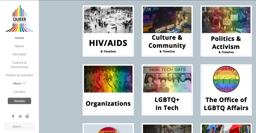
Screenshot of QueerSiliconValley.org homepage
QueerSiliconValley.org homepage shows some of the 17 topical categories offered.

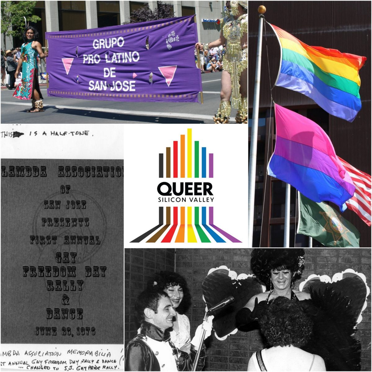
I was hired as an independent contractor to support the development and launch of a local history website. Originally intended as an in-person exhibit, QueerSiliconValley.org, a website documenting the history and culture of LGBTQ+ communities in and around Santa Clara County, California, was developed and launched in the summer and fall of 2020. Ken Yeager, BAYMEC Community Foundation’s Executive Director, spearheaded the effort and hired a small team of SJSU students to assist. Yeager’s “garage full of stuff” and a shared Google Drive was nowhere near exhibit-ready when we started. My role included project coordination, content wrangling, and helping set up the website.

Planning and communication via email alone quickly became untenable. During the early task breakdown phase, my teammates and I used a project management tool to assign and prioritize actions and research, but without the buy-in of our lead, the tool was abandoned to more lightweight methods. Part of the problem was that our lead would routinely communicate different requests and concerns to individual team members. To ensure the team was communicating those updates with each other, we established a private group chat, and I maintained a list of tasks related to whatever piece(s) of the project were active at a given time, along with who was responsible for them. I would also send an email as needed with this list as a status update. Team rapport was built via chat and Zoom meetings and was critical not only to our success, but social support during a sometimes-difficult process.

Each element of the project had its own tasking system, usually in Google Sheets, for managing notes, metadata, and status. This process became even more critical once the project hired a developer to build a custom WordPress site for us, meaning we had very specific content structure requirements to meet, as well as a needing a central place to note, report, and manage bugs and requests.

Throughout the project, I advocated for language and content changes to ensure the site was as inclusive as possible, such as including a content warning before stories involving violence (approved). I also helped the team learn some of the tech tools we used by creating a WordPress tips and tricks document and personally training our lead on how to navigate the site’s admin tools. I created a style guide, worked with our website developer to take ownership of several front-end display issues and fixes, and supported outreach and marketing efforts by creating slides, a media coverage page, and a ‘social sharing’ category. I did not stick to the letter of the project brief–if such a brief ever existed–and routinely offered suggestions and found ways to make things work.

Although I have not been actively involved the website management since December 2020, I know that new content being added has a clear place and format thanks to my efforts, and the team is empowered to carry out the work. Furthermore, the organizational systems I helped put in place set Ken Yeager and the History San Jose team up for success with an in-person exhibit opening mid-2021. It was by no means a perfect process–what is?–but having access to a variety of management theories and ideas meant I had ample tools to deploy as needed to keep things moving.

QueerSiliconValley.org website/online exhibit

Categories
iSchool Portfolio

Redesign Proposal: LasPilitas.com

For my graduate-level information architecture course, I teamed up remotely with two classmates to complete a semester-long design proposal with several distinct components and deliverables, including content and business strategy, content inventory, user research plan and initial card sort task results, personas, and mock-ups or wireframes. We chose to focus on the website of the family-run California native plant nursery Las Pilitas, a treasure trove of information about gardening and nature that appears among the top Google search results for queries relevant to its somewhat niche interests, but suffers from navigation and wayfinding issues. Based on the publicly available SEO data we could find, we posited that a relatively high bounce rate reflected this poor navigation, meaning users landed on a particular page, such as a page about a popular plant family, but did not explore image galleries, information about specific varieties of the plant, advice about landscaping with these plants, and so on.

Screenshot of my early research notes

As students, my teammates and I balanced responsibilities in order to maximize learning, as the project was an opportunity to practice a variety of skills and gain experience with new tools. I created all the wireframes in Balsamiq; developed our content inventory process in Airtable; designed the report, personas, and and slides; performed competitive and background research; drew the final version of the site map diagram; and did light project management/tracking in a simple spreadsheet.

Screenshot of a portion of our project tracking spreadsheet

Based on content inventory and competitive research, we knew we needed to improve the site’s overall organization for more meaningful breadcrumbs to give visitors entering via web search a sense of where they’re at and what else they might explore. We expected this would also support effective “related” links on deep nodes like plant detail pages. Additionally, we wanted to explore modernizing the global navigation bar with a fat menu design. We tested a number of possible user flows on the existing site and noted pain points to accomplishing common user goals like making a purchase or finding plant information, which informed several smaller decisions in terms of buttons, tooltips, search interface, and media experience.

Since this was a student project with no client contact or budget for in-depth user research, we were limited in our scope. The wireframes, labels, and personas are all effectively a first iteration and would undoubtedly evolve over the course of doing real client-contracted work. In particular, I’d like to be able to see site analytics and search traffic data to more effectively identify important entry points and stress cases for visitors and customers. Additionally, the content library is enormous, far too many documents to cover for our project, but a thorough accounting of the site’s content and how it’s internally linked would be an important starting point for a site redesign.

User flow from entry point (plant group page) to a plant detail (product) page to shopping experience comparing existing experience with proposed redesign wireframes

Translating ideas and inspiration to a coherent mock-up requires creativity and a clear sense of your users and the product. We realized that, for as much as we could do on spec, our work would only really be actionable after we could address the limitations. Despite that, the team benefitted from the collaborative design process overall and enjoyed learning new tools, like Balsamiq, Lucidchart, and Airtable, to make design ideas tangible.

Categories
iSchool Portfolio

Social Media Survey Research Plan

For my graduate-level survey research methods course, I devised a questionnaire and research proposal to investigate attitudes about personal disclosure and privacy on different social media platforms, especially among gender diverse people. I hypothesized that individuals with marginalized identities, including transgender people, would be more likely to either disguise or hide aspects of their identity or share less personal information on social media sites where those identities and/or perspectives put them at greater risk for harm, such as abuse, threats, or career problems.

As a solo project, I was responsible for developing the questionnaire, performing background research, and writing the proposal. Throughout the project, I consulted with my classmates, instructor, and external contacts to test and improve the survey instrument and overall research direction. To explore my research question, I knew I needed to collect survey data on two key areas: social media use and demographics. The specific question and answer sets for each were informed by background research, in particular several previous scholarly studies of social media and identity, as well as general knowledge of survey design best practices. 

There were three sections of social media questions, one each for Twitter, Instagram, and Facebook, each with nearly identical question and answer sets (UI copy and functionality differences between the sites reflected) so they could be directly compared. Each section began by asking respondents how often they used a given social media platform and only those who selected “I use it once a week or more often” were shown the following question set. The questions for each platform were divided into two pages to reduce participant fatigue. The first page asked participants about the type of information they share about themselves and their interests and what kind of privacy settings they use. The second, shorter page asked users to rate their agreement with five statements on a 5-point agreement scale. These statements were particularly influenced by previous research about online privacy concerns and community.

Screenshot of agreement questions from Facebook section of survey

For demographics, I wanted to include more aspects of identity than just my area of focus (gender) without seeming too invasive, as well as deliberating excluding answers that might identify respondents. Age was asked as a set of ranges; disability status was a simple yes/no; most questions allowed for multiple selections and every item could be skipped or marked “Prefer not to answer.” “Other” with a text field was an option for many questions, but I aimed to design the questionnaire so most respondents could easily answer without writing anything.

According to feedback from peers and survey testers, I mostly succeeded in my goal to write an easy-to-answer questionnaire that gave respondents options they felt described themselves and their point of view. Data collected with this instrument would have been readily analyzed and compared with (hopefully) minimal manual coding.

An important challenge I faced when designing this questionnaire involved writing questions and answers that were complete, accurate, AND readily answered without being time-consuming. Some of my questions asked users to recall information they might not have in mind, such as profile fields they completed. In an effort to eliminate open-ended questions entirely, I made a list of topics that people might post about, which started out very long (40 or so items) and ended up with 22 named topics, 14 of which combined two or more related topics. These labels might not have been a great fit for many respondents’ mental model of their interests, and I heard feedback from survey testers that they were confused about which boxes to check for more specific interests they had in mind. Additional user testing prior to launching the study would be ideal. Additionally, had I moved forward with this proposal, a key concern would be sampling–gender identity is not a screening question, nor can a gender diverse population be effectively quantified for the sake of random sampling techniques, so careful, targeted recruitment would be necessary to attract respondents with marginalized identities.

Screenshot of a spreadsheet with work-in-progress topic labels next to screenshot of question as it appeared in the survey

Research proposal and questionnaire (PDF) on Google Drive

Throughout this process, it was a pleasure to reconnect with survey research and quantitative analysis skills I first honed working in market research once upon a time. I learned quite a bit about the existing body of research about user behaviors and attitudes toward social media. We sometimes think of this as an emerging field, but relevant studies go back at least 20 years to online forums, newsgroups, and early social media like Friendster. It reinforced my desire to incorporate intersectionality and inclusion principles in my work as much as possible, which is why I did not opt to limit the study to participants of a particular gender identity and instead collect demographics that may reflect multiple oppressions to better contextualize my (proposed) findings.

Categories
iSchool Portfolio

Instructional Design: Excel Basics

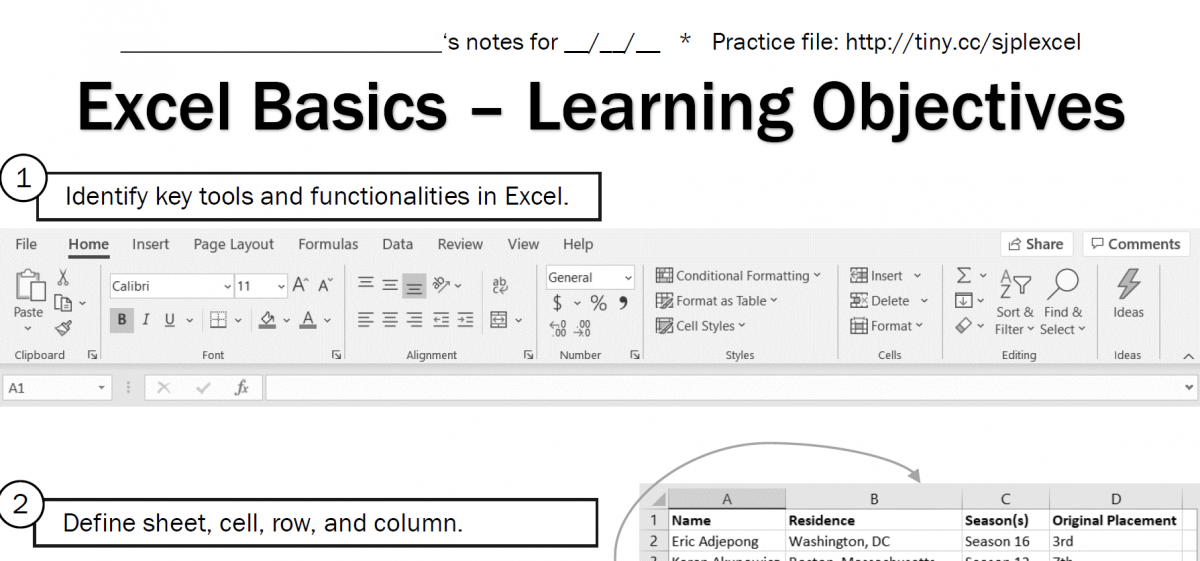
In Spring 2020, the culminative effort of my Instructional Design (non-K12) course was an instructional design plan for a topic and audience of our choosing. At the time of selection (pre-COVID-19), I was a regular “tech mentor” volunteer at my neighborhood library and worked with the librarian volunteer coordinator to identify and plan an “Excel Basics” class for adults in the nearby community. The plan includes handouts, a survey, and a downloadable learning tool (.xlsx file).

Instructional design plan & proposal (PDF) on Google Drive

https://www.youtube.com/watch?v=fRZ4l2Ee6gk
Video introduction to the course (submitted for peer evaluation with other materials)

Unfortunately, due to library closures, we did not schedule the class. Though it’s possible to offer this class online, as some library offerings are, I did not pursue it, as I suspect much of my target audience would find the technological barriers to participating overwhelm their desire to learn this tool, and face-to-face would be more productive, so it will have to wait.

Categories
iSchool Portfolio

Social Media Data Analysis: Twitter

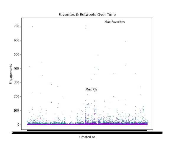
In Fall 2020, the final group project in Problem Solving With Data asked us to use newly-learned R and Python skills to analyze tweets to answer self-selected research questions aimed at addressing some kind of social good. My two-person team opted to look into Disability Twitter, a topic I proposed. I also pulled, filtered, and merged the data, as well as performing a large chunk of the content analysis and writing the corresponding sections of the report.

Final report (PDF) on Google Drive

While there are many aspects of the analysis I would do differently under other circumstances (see p. 28), it was a great opportunity to match my interest in/knowledge of a Twitter community with developing technical skills.

Categories
iSchool Portfolio

Cultural Timeline

Open in new tab

Asked to create a timeline on a humanities-related topic of our choosing for a Fall 2020 Digital Humanities course, I selected gender nonconformity in pop culture, a somewhat broad and tricky topic as the terminology and understanding of gender identity outside the binary is an evolving one, especially as it concerns culture and media. The resulting interactive object includes a selection of some–but certainly not all–instances of how these identities have been represented since the 1800s or so, along with brief analysis and commentary on those representations. Featured in the iSchool’s Student Showcase.

A complete reference list follows.

Media List

Bayer, J. (2019, April 3). Prince “Symbol” [Photograph]. Flickr. https://www.flickr.com/photos/23401011@N03/40565825163

Classic_Movie_Gals. (2008, June 12). Marlene Dietrich in Seven Sinners (1940) [Movie still]. Flickr. https://www.flickr.com/photos/27534776@N07/2574399770

Drümmkopf. (2007, July 2). Left hand of darkness [Photograph]. Flickr. https://www.flickr.com/photos/30453880@N04/4171543007

Hipp, M. (2012, May 20). Angry Inch – Hedwig & the Angry Inch [Video]. YouTube. https://www.youtube.com/watch?v=qWI6E8gdBzk

JasonOnEarth. (2007, August 1). Star Trek: TNG – “The Outcast” – ‘I Am Tired of Lies’ Scene [Video]. YouTube. https://www.youtube.com/watch?v=mMqGlSjAbwA

JonSnow. (2011, June 21). Pink Flamingos, live homicide [Video]. YouTube. https://www.youtube.com/watch?v=8bHKJt8beCI

Loose Women. (2017, June 30). Eddie Izzard on Why It Was Important for Him to Come Out | Loose Women [Video]. YouTube. https://www.youtube.com/watch?v=k2rYR0n5zTQ

Movieclips Classic Trailers. (2019, August 2). Boys Don’t Cry (1999) Trailer #1 [Video]. YouTube. https://www.youtube.com/watch?v=Ar9wGSd7KVQ

Ramirez, S. [@therealsararamirez]. (2020, August 27). New profile pic. In me is the capacity to be Girlish boy Boyish girl Boyish boy Girlish girl All Neither [Photograph]. Instagram. https://www.instagram.com/p/CEZak3AHwjG/

RuPaul’s Drag Race. (2020, October 8). Every Miss Congeniality’s Entrance (Compilation) [Video]. YouTube. https://www.youtube.com/watch?v=CalCAwLOJYo

Saturday Night Live. (2013, October 14). Pat at the Office [Video]. YouTube. https://www.youtube.com/watch?v=TYkjXMpKBBQ

STAT CHILE. (2016, January 8). Sylvester – You Make Me Feel (Mighty Real) (1978) HD [Video]. YouTube. https://www.youtube.com/watch?v=Ifr13Upytb4

Steven Universe. (2017, November 22). Stevonnie Run Into Trouble At A Dance Party | Alone Together | Cartoon Network [Video]. YouTube. https://www.youtube.com/watch?v=sEELKp3jLd4

Unknown. (n.d.) Mathilde “Missy” de Morny [Photograph]. Wikimedia Commons. https://commons.wikimedia.org/wiki/File:Mathilde_%E2%80%9CMissy%E2%80%9D_de_Morny.jpg

References

Amin, K. (2013). Ghosting transgender historicity in Colette’s The Pure and the Impure. L’Esprit Créateur, 53(1), 114–130. https://doi.org/10.1353/esp.2013.0012

Anders, C. J. (2019, February 25). Exploring the genius of Ursula Le Guin’s Hainish Cycle. Tor.com. https://www.tor.com/2019/02/25/unlocking-the-full-brilliance-of-ursula-le-guins-hainish-cycle/

Anderson, R. (2013). Fabulous: Sylvester James, black queer afrofuturism and the black fantastic. Dancecult, 5(2). https://doi.org/10.12801/1947-5403.2013.05.02.15

Arroyo, B. (2014). Sexualizing the transgendered body in Hedwig and the Angry Inch and Boys Don’t Cry. Textual Overtures, 2(1). https://doi.org/10.4000/ejas.14078

Avilez, G. (2019). Uncertain freedom: RuPaul, Sylvester, and black queer contingency. The Black Scholar, 49(2), 50–64. https://doi.org/10.1080/00064246.2019.1581978

Brodeur, N. (2020, January 31). When your signature ‘SNL’ character isn’t funny anymore: Julia Sweeney revisits Pat. Seattle Times. https://www.seattletimes.com/entertainment/when-your-signature-snl-character-isnt-funny-anymore-julia-sweeney-revisits-pat/

Butler, J. (1999). Gender trouble: Feminism and the subversion of identity (2nd ed.). Routledge.

Chambers, B. (2018, September 10). How The Left Hand of Darkness changed everything. LiteraryHub. https://lithub.com/how-the-left-hand-of-darkness-changed-everything/

Conway, J. J. (2012, June 29). Dress-down Friday: Mathilde de Morny. Strange Flowers. https://strangeflowers.wordpress.com/2012/06/29/dress-down-friday-mathilde-de-morny/

Cooper, B. (2002). Boys Don’t Cry and female masculinity: Reclaiming a life & dismantling the politics of normative heterosexuality. Critical Studies in Media Communication, 19(1), 44–63. https://doi.org/10.1080/07393180216552

Dean, L. (2020, August 10). Queer characters find power in “She-Ra” and “Steven Universe.” Bitch Media. https://www.bitchmedia.org/article/history-of-queer-representation-in-cartoons-she-ra-korra

Dry, J. (2019, December 12). As ‘Boys Don’t Cry’ joins National Film Registry, Kimberly Peirce addresses its complicated history. IndieWire. https://www.indiewire.com/2019/12/kimberly-peirce-interview-boys-dont-cry-transgender-1202196536/

Dunn, E. (2016). Steven Universe, fusion magic, and the queer cartoon carnivalesque. Gender Forum, 56. http://genderforum.org/transgender-and-the-media-issue-56-2016/

Ellsworth, M. P. (2016, April 22). Words of liberation: Prince’s lyrics and queer identity. MTV News. http://www.mtv.com/news/2871846/prince-lyrics-queer-identity/

Feder, S. (Director). (2020, June 19). Disclosure: Trans lives on screen [Documentary]. Netflix. https://www.netflix.com/title/81284247

Fitzgerald, T., & Marquez, L. (2020). Legendary children: The first decade of RuPaul’s Drag Race and the last century of queer life. Penguin Books.

Florido, H., Mitroff, K., Sugar, R. (Writers), &   Bae, K., Kim, S., Michalka, E., Jones-Quartey, I. (Directors). (2015, January 15). Alone Together (season 1, episode 37) [TV series episode]. In R. Sugar, W. Moreland, & C. Beaton (Executive Producers), Steven Universe. Cartoon Network Studios.

Gammel, I. (2012). Lacing up the gloves: Women, boxing and modernity. Cultural and Social History, 9(3), 369–390. https://doi.org/10.2752/147800412X13347542916620

Gudelunas, D. (2016). Culture jamming (and tucking): RuPaul’s Drag Race and unconventional reality. Queer Studies in Media & Popular Culture, 1(2), 231–249. https://doi.org/10.1386/qsmpc.1.2.231_1

Hallam, L. (2010). Monster queen: The transgressive body of Divine in Pink Flamingos. Bright Lights Film Journal. https://brightlightsfilm.com/monster-queen-the-transgressive-body-of-divine-in-pink-flamingos/

Hamel, J. (2018, May 11). The Pansy Craze: When gay nightlife in Los Angeles really kicked off. KCRW. https://www.kcrw.com/culture/shows/curious-coast/the-pansy-craze-when-gay-nightlife-in-los-angeles-really-kicked-off

Hawkins, S. (2017). The sun, the moon and stars: Prince Rogers Nelson, 1958–2016. Popular Music and Society, 40(1), 124–128. https://doi.org/10.1080/03007766.2016.1245482

Kelso, T. (2015). Still trapped in the U.S. media’s closet: Representations of gender-variant, pre-adolescent children. Journal of Homosexuality, 62(8), 1058–1097. https://doi.org/10.1080/00918369.2015.1021634

kydd, E. (1998). Star Trek: Insiders and “Outcasts.” Jump Cut: A Review of Contemporary Media, 42, 39–44. https://www.ejumpcut.org/archive/onlinessays/JC42folder/StarTrekGender.html

Le Guin, U. K. (2010). The left hand of darkness. Ace Books.

Patterson, G., & Spencer, L. G. (2017). What’s so funny about a snowman in a tiara? Exploring gender identity and gender nonconformity in children’s animated films. Queer Studies in Media & Popular Culture, 2(1), 73–93. https://doi.org/10.1386/qsmpc.2.1.73_1

Pidduck, J. (2001). The Boys Don’t Cry debate: Risk and queer spectatorship. Screen, 42(1), 97–102. https://doi.org/10.1093/screen/42.1.97

Poole, R. J. (2018). “Rise like two angels in the night:” Sexualized violence against queers in American film. European Journal of American Studies, 13(4). https://doi.org/10.4000/ejas.14078

Prince. (1984, June 25). I Would Die 4 U [Song]. On Purple Rain [Album]. Warner Bros. Records.

Richards, J. (2016, October 19). Do we need to time warp again? Queer identity and the problems with the Rocky Horror Picture Show. Bitch Media. https://www.bitchmedia.org/article/do-we-need-time-warp-again/queer-identity-and-problems-rocky-horror-picture-show

Schmidt, T. (2010). “Being cool about it”: Performing gender with Eddie Izzard. Gender Forum, 29, 20–30. http://genderforum.org/private-i-public-eye-issue-29-2010/

Schoellkopf, C. (2017, June 13). Eddie Izzard reflects on coming out as transgender, why Caitlyn Jenner is a role model. The Hollywood Reporter. https://www.hollywoodreporter.com/bookmark/eddie-izzard-reflects-coming-as-transgender-why-caitlyn-jenner-is-a-role-model-1012926

Song, L., & Tan, C. K. K. (2020). The final frontier: Imagining queer futurity in Star Trek. Continuum, 34(4), 577–589. https://doi.org/10.1080/10304312.2020.1750564

Taylor, J. (Writer) & Scheerer, R. (Director). (1992, March 16). The Outcast (season 5, episode 17) [TV series episode]. In M. Piller, G. Roddenberry, & R. Berman (Executive Producers), Star Trek: The Next Generation. Paramount Television.

The Matrix is a “trans metaphor”, Lilly Wachowski says. (2020, August 7). BBC News. https://www.bbc.com/news/newsbeat-53692435

Whiteneir, K. T. (2019). Dig if you will the picture: Prince’s subversion of hegemonic black masculinity, and the fallacy of racial transcendence. Howard Journal of Communications, 30(2), 129–143. https://doi.org/10.1080/10646175.2018.1536566

McEnany, A., Mason, T., Wachowski, L., Adler, J., Berns, A., Hernandez, T., Mattis, L., & Sweeney, J. (Executive Producers). (2019-present). Work in progress [TV series]. Circle of Confusion; Showtime Networks.

Young, E. (2019). They/them/their: A guide to nonbinary and genderqueer identities. Jessica Kingsley Publishers.

Categories
Consulting & Freelance Food Blog

Cooking with Spade & Plow!

When COVID-19 hit, we signed up for the CSA of one of our favorite Campbell market vendors, Spade & Plow in San Martin, Calif. And they asked me to do a guest post on their blog in exchange for some really beautiful extra veggies they wanted to highlight: spring shallots, radicchio, squash blossoms, and summer squash. I really enjoyed it, and you can read about it here:

FIRE UP THE GRILL! SIZZLING SPRING FAVORITES

Categories
iSchool Portfolio

UX Evaluation & Prototyping: Yummly

For my graduate-level web usability course, I completed a solo project that explored a design problem and its possible solutions. I hypothesized that a key problem with recipe search experiences is the discoverability and ease of using filters so users could easily sift through recipes irrelevant to them based on ingredients, diet, style, or other factors. I focused on Yummly.com, a recipe search tool that already offers many of these filters, but could use improvements in some aspects of the user experience.

Compilation of annotated screenshots highlighting possible UX issues with top recipe search experiences
Screenshot of notes from informal user interviews collected via Instagram direct messages

Without a budget or resources for in-depth user research, I reached out to my personal network via Instagram to solicit feedback on recipe search experiences, including what they use to find recipes and their frustrations with recipe search. After identifying key user concerns, I performed competitive analysis of top recipe sites and identified their strengths and weaknesses. Based on this background research, I devised a list of potential user interface changes, taking heavy inspiration from Jenifer Tidwell’s Designing Interfaces patterns. These included a clear entry point the filter wizard to make this feature more prominent; adding modules for features results and suggested filters within the search results to enhance discovery and help users struggling with too many results; and using modal panels (popover windows) for filters, results, and source pages to address the problem with jumping users out of the search results without any way back. I also designed a “favorite site” feature that, in conjunction with an existing “saved recipes” function, could help personalize results for logged-in users.

Screenshot featuring multiple slides with prototype components

I faced significant challenges while working on this project, not least because it happened during Spring 2020 and COVID-19 restrictions severely limited my ability to perform prototype testing. Although the assignment only called for paper prototypes, at the time, I found it easier to use PowerPoint to develop a high-fidelity clickable prototype using screenshots, shapes/text, and embedded links to other slides to simulate clicking and scrolling. I had not yet become acquainted with professional wireframing tools and my instructor did not encourage remote user testing, so I could only test the experience with my partner.

Even this limited testing suggested a number of changes for a second iteration of the prototype and was an informative experience. Overall, as a first attempt at a solo user research and testing initiative, I learned quite a bit about how much I have to learn from other people–even people who are relatively “similar” to me–and that even relatively small-looking design iterations require thorough consideration. I also really enjoyed the process. Details of my process, findings, testing, and learning reflection can all be found in the linked report.