Categories
iSchool Portfolio

Redesign Proposal: LasPilitas.com

For my graduate-level information architecture course, I teamed up remotely with two classmates to complete a semester-long design proposal with several distinct components and deliverables, including content and business strategy, content inventory, user research plan and initial card sort task results, personas, and mock-ups or wireframes. We chose to focus on the website of the family-run California native plant nursery Las Pilitas, a treasure trove of information about gardening and nature that appears among the top Google search results for queries relevant to its somewhat niche interests, but suffers from navigation and wayfinding issues. Based on the publicly available SEO data we could find, we posited that a relatively high bounce rate reflected this poor navigation, meaning users landed on a particular page, such as a page about a popular plant family, but did not explore image galleries, information about specific varieties of the plant, advice about landscaping with these plants, and so on.

Screenshot of my early research notes

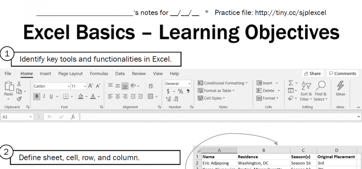
As students, my teammates and I balanced responsibilities in order to maximize learning, as the project was an opportunity to practice a variety of skills and gain experience with new tools. I created all the wireframes in Balsamiq; developed our content inventory process in Airtable; designed the report, personas, and and slides; performed competitive and background research; drew the final version of the site map diagram; and did light project management/tracking in a simple spreadsheet.

Screenshot of a portion of our project tracking spreadsheet

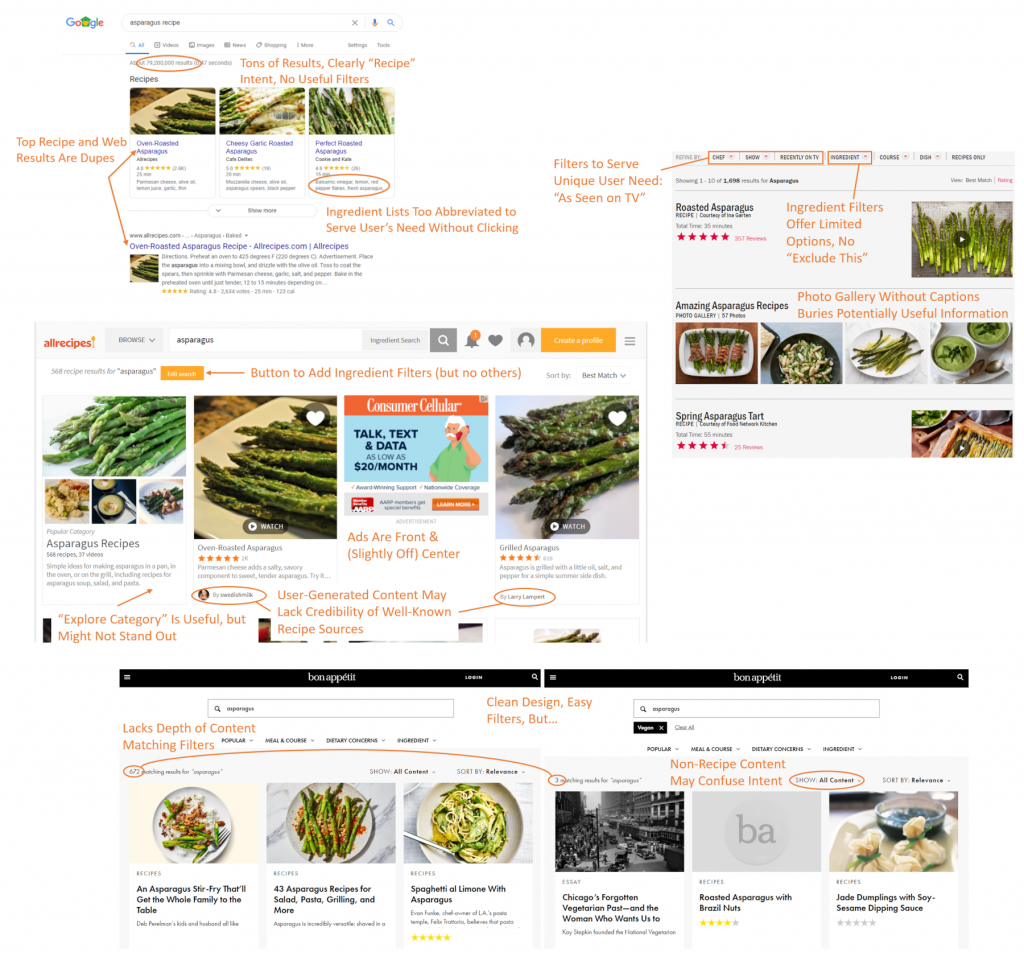
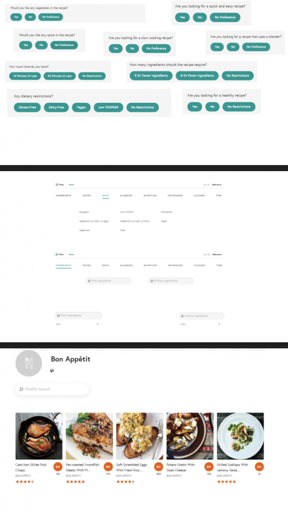
Based on content inventory and competitive research, we knew we needed to improve the site’s overall organization for more meaningful breadcrumbs to give visitors entering via web search a sense of where they’re at and what else they might explore. We expected this would also support effective “related” links on deep nodes like plant detail pages. Additionally, we wanted to explore modernizing the global navigation bar with a fat menu design. We tested a number of possible user flows on the existing site and noted pain points to accomplishing common user goals like making a purchase or finding plant information, which informed several smaller decisions in terms of buttons, tooltips, search interface, and media experience.

Since this was a student project with no client contact or budget for in-depth user research, we were limited in our scope. The wireframes, labels, and personas are all effectively a first iteration and would undoubtedly evolve over the course of doing real client-contracted work. In particular, I’d like to be able to see site analytics and search traffic data to more effectively identify important entry points and stress cases for visitors and customers. Additionally, the content library is enormous, far too many documents to cover for our project, but a thorough accounting of the site’s content and how it’s internally linked would be an important starting point for a site redesign.

User flow from entry point (plant group page) to a plant detail (product) page to shopping experience comparing existing experience with proposed redesign wireframes

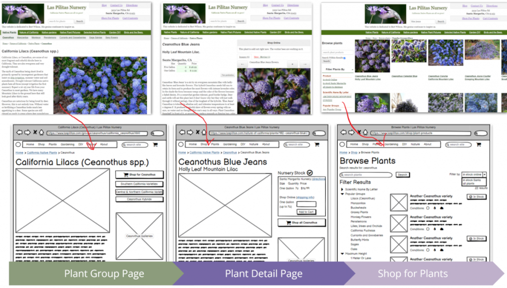
Translating ideas and inspiration to a coherent mock-up requires creativity and a clear sense of your users and the product. We realized that, for as much as we could do on spec, our work would only really be actionable after we could address the limitations. Despite that, the team benefitted from the collaborative design process overall and enjoyed learning new tools, like Balsamiq, Lucidchart, and Airtable, to make design ideas tangible.

Categories
iSchool Portfolio

Instructional Design: Excel Basics

In Spring 2020, the culminative effort of my Instructional Design (non-K12) course was an instructional design plan for a topic and audience of our choosing. At the time of selection (pre-COVID-19), I was a regular “tech mentor” volunteer at my neighborhood library and worked with the librarian volunteer coordinator to identify and plan an “Excel Basics” class for adults in the nearby community. The plan includes handouts, a survey, and a downloadable learning tool (.xlsx file).

Instructional design plan & proposal (PDF) on Google Drive

Video introduction to the course (submitted for peer evaluation with other materials)

Unfortunately, due to library closures, we did not schedule the class. Though it’s possible to offer this class online, as some library offerings are, I did not pursue it, as I suspect much of my target audience would find the technological barriers to participating overwhelm their desire to learn this tool, and face-to-face would be more productive, so it will have to wait.

Categories
iSchool Portfolio

UX Evaluation & Prototyping: Yummly

For my graduate-level web usability course, I completed a solo project that explored a design problem and its possible solutions. I hypothesized that a key problem with recipe search experiences is the discoverability and ease of using filters so users could easily sift through recipes irrelevant to them based on ingredients, diet, style, or other factors. I focused on Yummly.com, a recipe search tool that already offers many of these filters, but could use improvements in some aspects of the user experience.

Compilation of annotated screenshots highlighting possible UX issues with top recipe search experiences
Screenshot of notes from informal user interviews collected via Instagram direct messages

Without a budget or resources for in-depth user research, I reached out to my personal network via Instagram to solicit feedback on recipe search experiences, including what they use to find recipes and their frustrations with recipe search. After identifying key user concerns, I performed competitive analysis of top recipe sites and identified their strengths and weaknesses. Based on this background research, I devised a list of potential user interface changes, taking heavy inspiration from Jenifer Tidwell’s Designing Interfaces patterns. These included a clear entry point the filter wizard to make this feature more prominent; adding modules for features results and suggested filters within the search results to enhance discovery and help users struggling with too many results; and using modal panels (popover windows) for filters, results, and source pages to address the problem with jumping users out of the search results without any way back. I also designed a “favorite site” feature that, in conjunction with an existing “saved recipes” function, could help personalize results for logged-in users.

Screenshot featuring multiple slides with prototype components

I faced significant challenges while working on this project, not least because it happened during Spring 2020 and COVID-19 restrictions severely limited my ability to perform prototype testing. Although the assignment only called for paper prototypes, at the time, I found it easier to use PowerPoint to develop a high-fidelity clickable prototype using screenshots, shapes/text, and embedded links to other slides to simulate clicking and scrolling. I had not yet become acquainted with professional wireframing tools and my instructor did not encourage remote user testing, so I could only test the experience with my partner.

Even this limited testing suggested a number of changes for a second iteration of the prototype and was an informative experience. Overall, as a first attempt at a solo user research and testing initiative, I learned quite a bit about how much I have to learn from other people–even people who are relatively “similar” to me–and that even relatively small-looking design iterations require thorough consideration. I also really enjoyed the process. Details of my process, findings, testing, and learning reflection can all be found in the linked report.

Categories
Portfolio Yahoo

Data-Driven Feature Generation: Earthquakes

Used USGS API to directly answer variety of query patterns looking for recent earthquake information.

Screenshot of search result for recent earthquakes near Oklahoma
Recent earthquakes via USGS API with location-specific keywords and results

https://search.yahoo.com/search?p=latest+earthquakes

Ask
My team, a UX/editorial group that worked with Yahoo’s search content management platform was broadly tasked with generating and working on ideas for new search features. One method of doing this was to browse government developer sites for APIs and structured data that might map to valuable search user needs. That’s how I learned about the United States Geological Service’s “latest earthquakes” API.

Process
First, I wanted to determine how often people search for earthquake information, and how they formulate such queries. Once internal analytics tools validated that there was sufficient search volume to proceed, I used a tool that let me pull queries by URL–that is, I got a report containing search queries that resulted in a web result click anywhere on the “earthquake.usgs.gov” domain. I classified these queries as “earthquake data intent” and “not earthquake data intent,” and further by patterns like “6.2 earthquake,” “earthquake in Japan,” and “latest LA earthquakes.”

Once I identified the main earthquake-intent patterns, I needed to determine how best to handle location information. Because the USGS API supported location by both a radius around a single point (appropriate queries containing a city name) and a bounding box with minimum and maximum latitude and longitude (worked for countries and regions), I created a list of popular locations for which bounding box location was more useful than a radius and let a global location list handle everything else.

Finally, the UX proved trickier than hoped. Initially I hoped to include a map component, which was supported in our tool, but a front end bug prevented it from rendering correctly, so I worked with a designer to massage a text-only table into an appealing result that presented all the relevant information. (Because the bug did not appear for any high-priority features, the engineering time was unable to devote time to fixing it.)

Result
Earthquakes represented an interesting use case for location handling. The search feature routinely spiked any time the earth moved and appeared alongside news headlines.

Categories
Portfolio Yahoo

Yahoo Verticals & Media in Search

Keyword mapping and search placement for curated original video content.

Screenshot of an inline video player search result for a Yahoo News documentary titled "Uniquely Nasty: The U.S. Government's War on Gays"
Yahoo News original documentary – full video played inline on top of search results
Screenshot of a video search result for a Yahoo News documentary titled "Uniquely Nasty: The U.S. Government's War on Gays"
Smaller version among search results for alternative keywords
(no longer live)

Ask

Yahoo’s video site, Screen, hosted a wide variety of original content over the years, and they periodically asked for this content to appear in search results.

Process

Over the years, I built a relationship with contacts working on Yahoo’s video properties to support their efforts to receive views via relevant search traffic. While at first these appeared in search only as enhanced hyperlinks, eventually the search front-end team implemented an inline player functionality so we could embed Yahoo original content and other videos directly on a search results page. I created an expandable search feature that allowed me to respond quickly to the video team’s requests and generate appropriate keyword lists.

Result

Teams throughout Yahoo knew they could rely on Search to support their efforts to promote premium original content on-network without using significant resources per request.

Built special “vertical search” feature to support new property launches and reduce maintenance.

Screenshot of a Yahoo Tech vertical search result for writer David Pogue
Vertical search experience embedded in web search results – set up in support of Yahoo’s Digital Magazines strategy (Tech, Style, Movies, etc.)

Ask

Yahoo launched several new media verticals called “Magazines” and did not migrate any corresponding vertical search experiences, which were based on an older platform. Instead, a search product manager was tasked with adding vertical content to web search, filtered according to the user’s site of origin, and they enlisted my support to create and launch the necessary features in our search content management platform.

Process

Each query sent from a search box included more than just the user’s query–it contained referral information, usually unique to the property or even page. I used this information to determine when a search experience should appear, as well as pass variables to a backend. The news backend, which indexed news from hundreds of sources worldwide, including Yahoo’s own sites, could return articles matching any query, filtered by property and sorted by freshness.

Expanding on a template design already in use for news results in general web search, I created a “vertical search” feature that included up to 10 results with thumbnails for each and paginated results if there were more than 10 stories matching a given query. This large search feature appeared on top of the usual web algorithmic links and any other non-monetized search features.

Product owners also asked for Magazine stories to be highlighted in web search results (in a less aggressive form, of course). I created simple “navigational” features with a max of 3 stories to appear on searches by Magazine name and featured writers to satisfy their primary need. Because Magazine stories were indexed along with all news content, these stories could appear in regular news search results without any extra effort.

“Emily always brings a number of ideas and potential solutions to a problem, but will back them up with execution reliably, quickly, and self-sufficiently, and manages dependencies deftly and efficiently. When tasked to launch international Magazine Search in Q4, Emily took the lead, coordinating with int’l editorial leads, offering assistance where necessary, and following up to ensure completion, ensuring the appropriate Product approvals (from me) and transparency of communication. The task was completed successfully, quickly, and helped ensure a Green rating on that quarterly goal.”

Product Manager, Vertical Search

Result

No-maintenance, low-effort vertical search launched on all new Magazines. Sites and big-name authors were effectively promoted in web search.

Created rich search experiences to feature Yahoo Screen originals alongside knowledge graph.

Screenshot of Yahoo Search results for the TV series "Community" including season 6 episodes streaming on Yahoo Screen
Community Season 6 – featured Yahoo Screen video content + keyword list cultivation for TV series knowledge graph (no longer active due to deprecation of Yahoo Screen)

When Yahoo Screen made its foray into full-length original TV series with Community and others, we were ready to go in search. I made sure that the latest episodes carousel had excellent coverage and TV Series Knowledge Graph contained accurate, detailed profiles.

Meanwhile…

Photo of Emily with actor Gillian Jacobs when the latter visited Yahoo in Sunnyvale
Grabbed a selfie with Gillian Jacobs

Created relevant search features to highlight licensed SNL video content.

Screenshot of video result for the famous "More Cowbell" SNL sketch
Saturday Night Live on Yahoo Screen – mapping keywords to vast back catalog of sketches and video collections (No longer live due to deprecation of Yahoo Screen)

Ask

Yahoo Screen was planning to release a massive catalog of Saturday Night Live clips, spanning the series entire run. I was approached to create relevant search features to highlight the licensed content.

Process

I was given a list of video collections–recurring characters, hosts, themes, etc.–and an enormous spreadsheet containing video metadata for every single item in the catalog. My task: organize this data into discrete sets of keywords to bring up the precise, relevant video result or carousel of results, and investigate existing search coverage of SNL to ensure we cover those videos.

In addition to creating basic query patterns for such a huge catalog, I was able to have some fun creating aliases for the more popular videos, such as “needs more cowbell.” Specific clips and characters were likely to appear in search logs shortly after new episodes aired, so I planned to monitor dashboards in order to add new videos and keywords Sunday mornings.

Result

I turned around a huge list of keywords in a matter of days so the search experience launched at the same time as the Screen content. Post-launch, I trained a teammate how to look up video IDs and identify relevant query patterns so we could take advantage of the unique, timely spikes that only SNL had.