Ask
McStuffies, PhD is a crafter who sells their handmade items at craft fairs and online. Their main offerings are crochet stuffed animals and dolls, but more recently they’ve branched out into buttons, stickers, and other custom designed items.
The client had been using Square for both payments and an online storefront, but was dissatisfied with aspects of the inventory management and tagging offered by that platform. They purchased a domain and hosting for a WordPress/WooCommerce site and hired me to help them migrate to the new site.
There was no budget for themes, and while I’d worked with WordPress before, this was my first experience with WooCommerce.

Process
There were several tasks to complete itself:
- Import data from Square and troubleshoot ongoing sync issues. This was the client’s responsibility, but I offered support as needed.
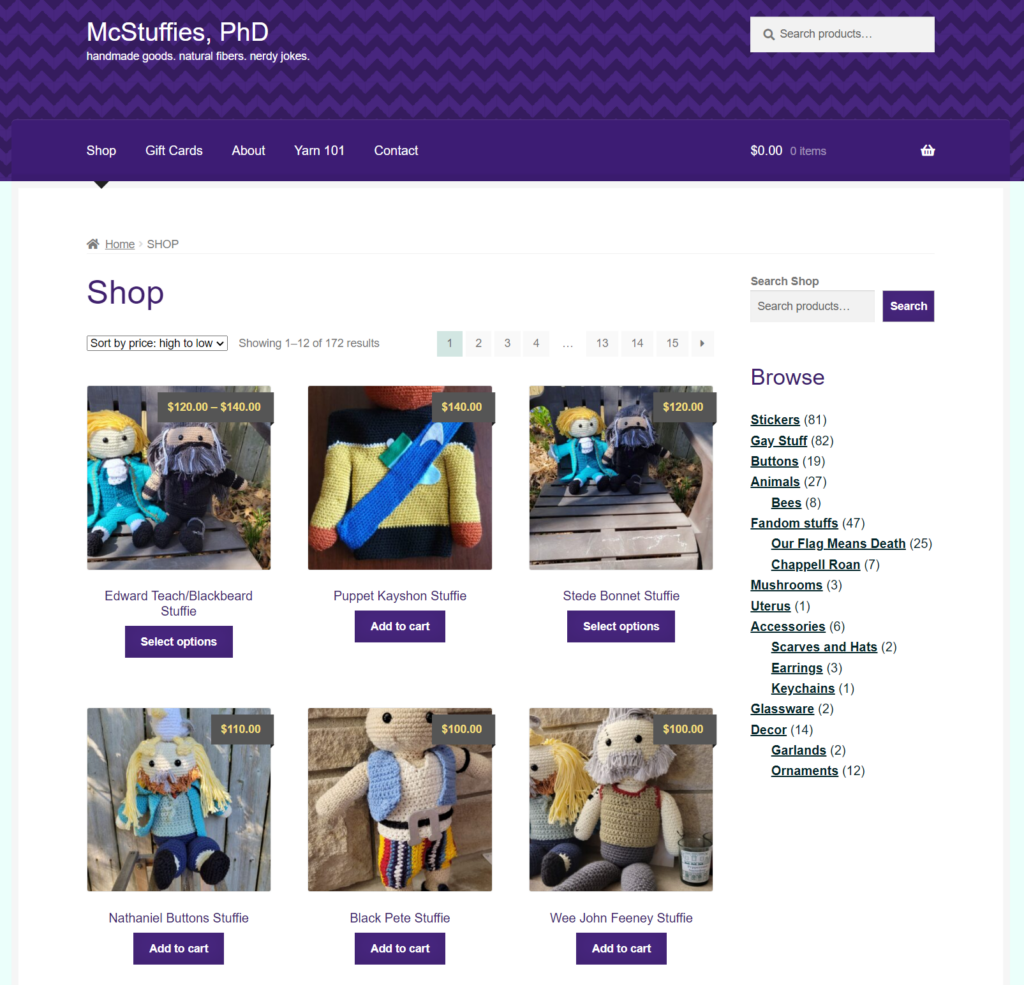
- Adjust category/tag taxonomy to better suit client’s needs and make the site more navigable. Because the client maintains these, I did not make significant changes to the labels themselves, but created a hierarchy and made suggestions. Some categories became obsolete thanks to WooCommerce’s default features, including “Sale.”
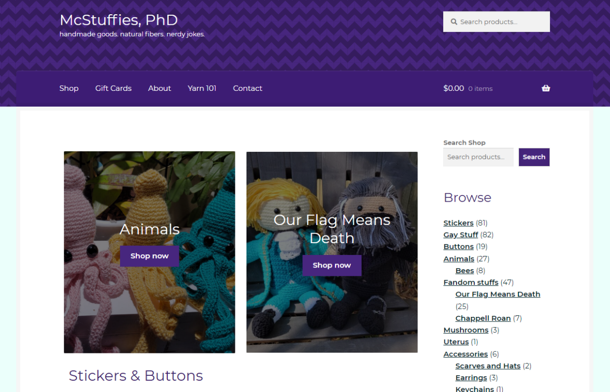
- Identify and test suitable WooCommerce themes and layouts. Options were limited, but we landed on Boutique, a child theme of Storefront, due to overall layout preferences and customization options.
- Create custom color scheme, CSS, and assets as needed. Client had an existing logo that I was able to incorporate into a default placeholder product image and site favicon. The logo also served as the basis for the overall color scheme, its dark teal and coral red finding balance with a deep purple, earthy yellow, and pale mint.
- Build a new homepage to feature categories and products according to the client’s needs. For the sake of simplicity, we launched with top categories featured, but as they grow into the site, they might take advantage of functionalities like “featured products.”
- Migrate static informational pages and develop new features, including a basic contact form to replace a simple email link and a new events schedule. I created a simple blog post template for the client to enter craft show information and added a plugin to make copying posts easier. The calendar was embedded into the new homepage using a plugin.
- Take feedback from the client and testers to make adjustments to the layout, especially on mobile.
Result
I wanted to leave the client with a website they felt confident with, and in that, we succeeded. The new McStuffiesPhD.com offers a cleaner layout with a pleasing color scheme that’s easy to browse on any device and easier to maintain for the client. It’s designed with a certain amount of whimsy, as appropriate for the nature of the products available, without being content-heavy, slow, or overwhelming.
The homepage includes two important features to drive sales and engagement: a display of “latest” products in popular low-price categories (stickers and buttons) and a list of upcoming craft fairs and events where visitors will find McStuffies, PhD in person. The calendar in particular gives the client and customers alike a central place to locate this information (which might otherwise be found in scattered social media posts) and promotes events within their regional community.
Having never previously set up an ecommerce site, the whole project was a great learning experience, especially in terms of problem-solving when it came to technical and display issues. We weren’t building something from scratch or reinventing the wheel, just trying to make the client’s life easier and better present their work within constraints. It’s also given me a few things to better incorporate in future projects at an earlier stage, such as improving content for accessibility and a stronger focus on the mobile experience.